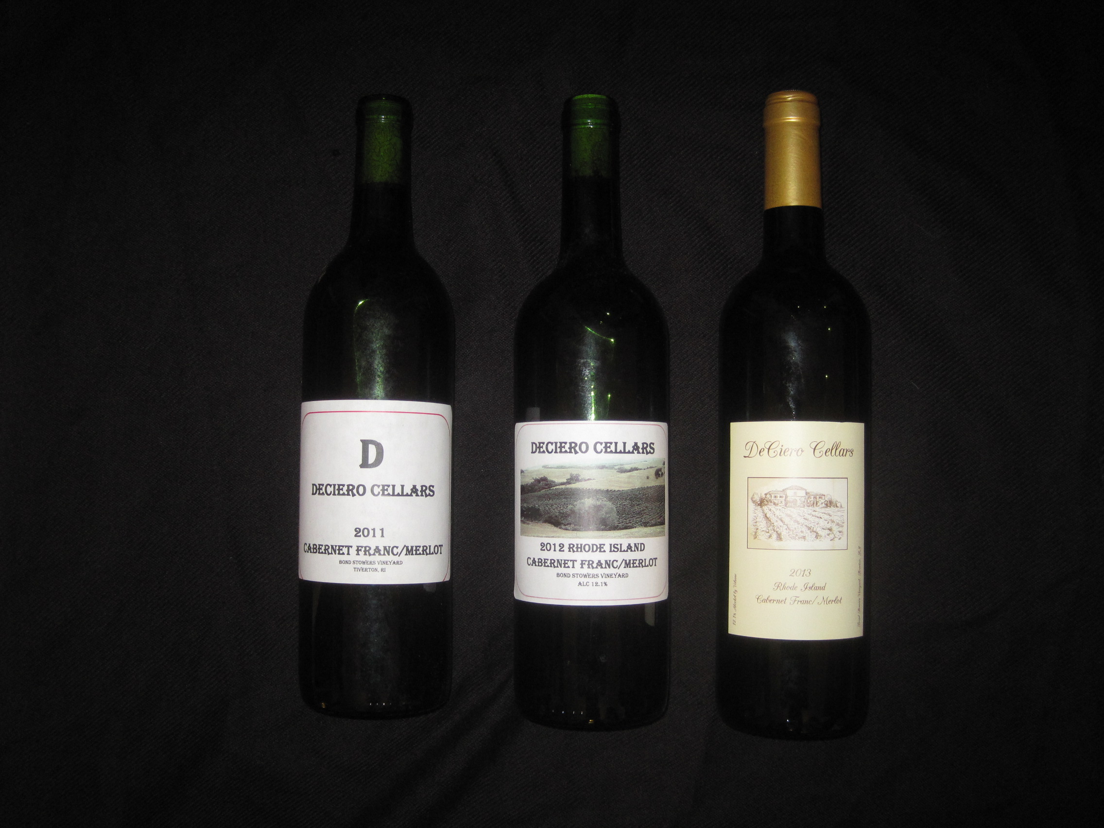
Evolution of the Label
- Details
- Published: Monday, 08 December 2014 09:36
- Written by David DeCiero
After winemaking now for 6 years, I have mastered all of the basics of winemaking but continue to learn new things. The one thing I was really unhappy with was my labelling. I decided this year to look to have some designed and professionally printed.
The first wines I made were kit wines. These usually come with labels (at least the high end ones), but they are incredibly impersonal. Once I switched to making wine from grapes, I was forced to think about creating my own labels. I took the cheap route first, which entailed buying some removable labels from Amazon ($11 for 150 at the time) and printing them on a laser printer. The design was pretty bad (and simplistic) and the printing left a lot to be desired. My wife also was disappointed in it, as I did not include her in the process. This is the one in the left of the picture, the 2011.
The second year, I looked at a lot of commercial labels and took note of what I liked and did not like. I did not like the “grab attention” labels, which had something very loud or cute on it. I was going for a very simple design that was more Old World. This equated to a basic design with the name of the producer, a small picture, then the varietal name. I once again went with the removable labels and a laser printer. After selecting a picture of a vineyard in Sonoma we had taken while there, I printed them out. Although it came out better, it still did not look commercial. It looked rather bland. This is the one in the center of the picture, the 2012.
Finally, I decided to use a commercial printer and select a sketch instead of a picture. I was always dismayed by the seemingly high price of “make your own” labels, but I was lucky to find a company called Uprinting.com. The price was extremely reasonable and they had their own label designer that was pretty easy to use. After finding a sketch of a house and vineyard, I selected a font and went to work. I can honestly say that this looks like a commercial label. I’m happy with what it looks like and will be using the same design moving forward.